3. Take a look at St. Clair Colleges website. In relation to visuals, what would you propose to St. Clair College to improve/enhance this new website to effectively market to potential incoming local domestic students. Please provide three (3) recommendations and justify your answer with detailed reasoning. (9 Marks)
Recommendation One
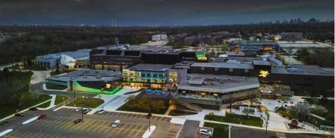
Change the main photo

Justification
I recommend changing the main photo because it is ugly and not very appealing to the eye. It doesn’t represent the St. Clair building for what it is and what it offers. This photo makes it look like it is bland and the size of a high school, which is not very appealing to many people. It only shows the top part of the building to showcase the st. clair writing and the saints nation but that is not drawing anyone in. It is old and outdated.
They have an opportunity to showcase how big and good the campus is by adding a carousel of at least two photos highlighting the best parts of the campus.
Examples of other photos they could/should use to become more relevant and appealing to students:


Recommendation Two
Important or special announcement background photos change.

Justification
These announcements could seem very interesting to learn more about, but the photos are very boring and don’t match the excitement of the text. The photos are repetitive and don’t mean anything or matter to anyone who may want to click to find out more. I feel it would be more beneficial to include photos of what the text is talking about to be more relevant and show the viewers more of the campus and the cool things we have to offer. Not random people they don’t know or care about. This will show future students the things and places they might be able to do and visit.
Example of a photo they could use instead:

For the next section of text and photo, the text talks about an event of open education week, which could be interesting but then shows random people in front of a sign. That appeals to students very minimally and doesn’t spark any sort of ingruigment or curiosity. Visuals carry interest. Open Education Week is a seminar, but you wouldn’t know that by the photo. They can add a photo of a St. Clair gathering to show what it is and spike interest.
Example of a photo they could use instead:

Recommendation Three
Dometic application main image change

Justification
In my opinion, this looks sloppy and not professionally done. You can visibly see the poor cut-out skills on the bodies, and looking at it doesn’t give off a professional and highly credible website. Call me crazy, but it seems like a first-year Photoshop class project. (Sorry to whoever made this, and I hope it is none of my profs, but I know Cassey would never hand this in)
My suggestion is that they take an actual photo of everyone together to make the photo look more natural and professional. I feel the background should be less crowded and busy because it highlights the poor editing. I feel the background can still stay green since it is the school colours but keep it a simple background such as the school or and overview of the campus.
Examples of images to input instead: